

Appearance and text
The five styles, where a widget puts itself on the page, colours by role, and writing what it says.
Appearance is its own screen, in the app’s sidebar above Analytics. Your widgets run along the top, with the rest behind More widgets once you have more than four, and the one you pick is styled below, with a live preview beside the settings. Each widget keeps its own look. From the widget editor, Edit appearance opens this screen on that widget, and Open widget settings takes you back. What a widget says stays with the widget, in its Text section.
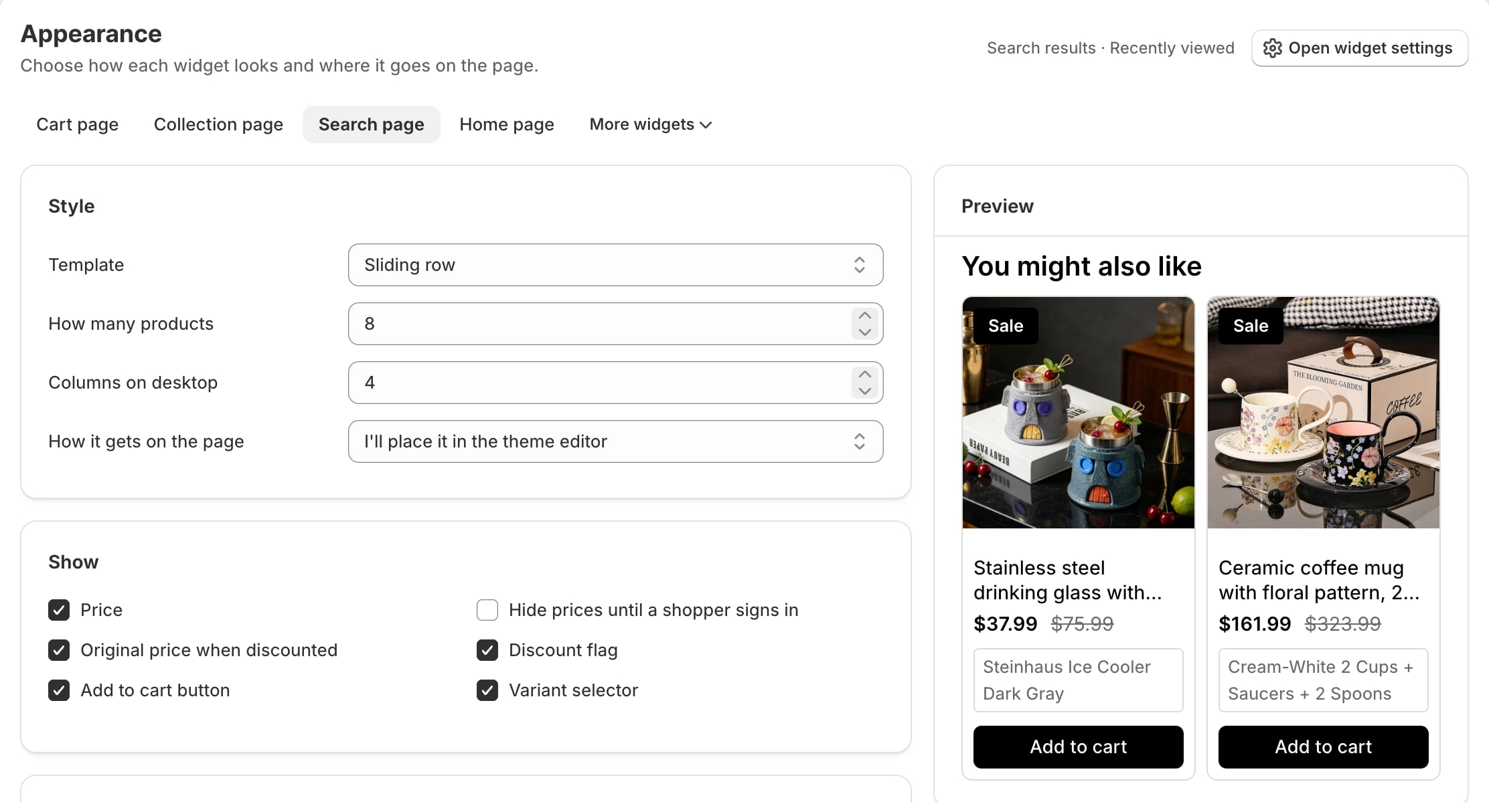
Style
Template offers five ways to draw the same products or, for a Buy together widget, three of its own.
| Style | What it is, and where it earns its place |
|---|---|
| Sliding row | One row that scrolls sideways, with arrows, and can be dragged with a mouse. For a product page with room for a full-width row. |
| Grid | Several across, wrapping onto more rows. For showing a lot at once. |
| Stacked list | Rows with the picture beside the text. For narrow columns where cards would be tiny. Add-ons start here. |
| Compact rows | Tight rows divided by a line. For a cart page or drawer, where space is short. |
| Single column | One ordinary card per row, picture on top. For a sidebar. |
| Buy together style | What a shopper sees |
|---|---|
| Thumbnails and a checklist | A strip of pictures joined by a plus, then one tickable row per product. The default. |
| Boxed rows | Each product in its own bordered row, with its picture, price and variant picker. Good where the names are long. |
| Cards side by side | Full product cards joined by a plus, with the total and one Add to cart button beside them where there is room. There are no tick boxes: the set is taken or left. |
How many products sets the most the widget shows. Columns on desktop only appears for the sliding row and the grid; the other styles put one item per row.
Where it goes on the page
Three answers, under How it gets on the page.
| Setting | What happens |
|---|---|
| I'll place it in the theme editor | The default. Nothing appears until you add the Somix block yourself, which is also where you decide exactly where it sits. |
| Below the add to cart button | The widget puts itself under your theme's add-to-cart form. Product pages only, since that is the only page with one. |
| Next to an element I choose | You give a CSS selector, such as .product__description, and under Put the widget say whether it goes before it, after it, or inside it at the start or the end. |
If nothing on the page matches, because a selector has a typo or the page has no add-to-cart form, the page is left exactly as it was. And a widget that places itself stands aside when a Somix block on the same page is already drawing it, so it never appears twice.
What each card shows
The Show switches decide what a card carries:
- Price, and Original price when discounted struck through beside it
- Discount flag: a small sale label in the picture’s corner. It starts off for the stacked list and compact rows, where it would cover most of a small picture.
- Add to cart button and Variant selector
- Hide prices until a shopper signs in, described below
- Buy together: start with every item checked, for the checklist and boxed rows. Off, every row starts unticked, the total starts at zero and the button waits for a choice. The preview shows the same.
A card always quotes the variant its button adds. With a variant picker, choose another variant and the price, the struck-through original and the sale flag all change with it. Without one, the card shows the first variant in stock. The shape of the product pictures is set once for the whole shop, under Settings.
Hiding prices from signed-out visitors
For wholesale and members-only catalogues, prices can be hidden until a shopper signs in. It is decided in your theme against Shopify’s own customer object, so no request reaches us and no shopper is identified. The widget only ever learns “signed in or not”. This is a Pro setting, and it appears once Allow widgets to hide prices from signed-out shoppers is on in Settings.
Colours
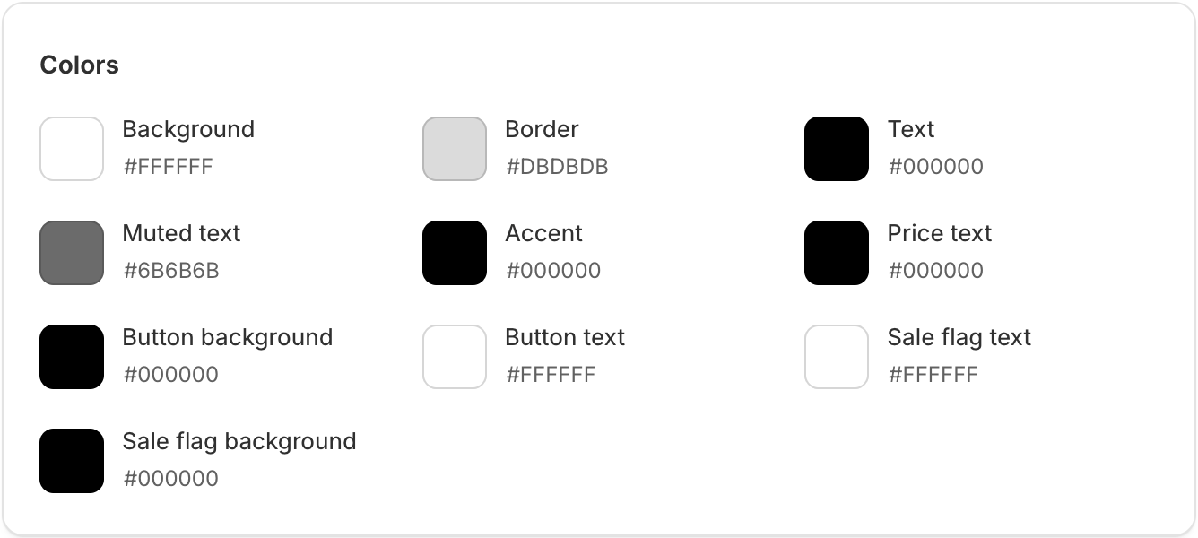
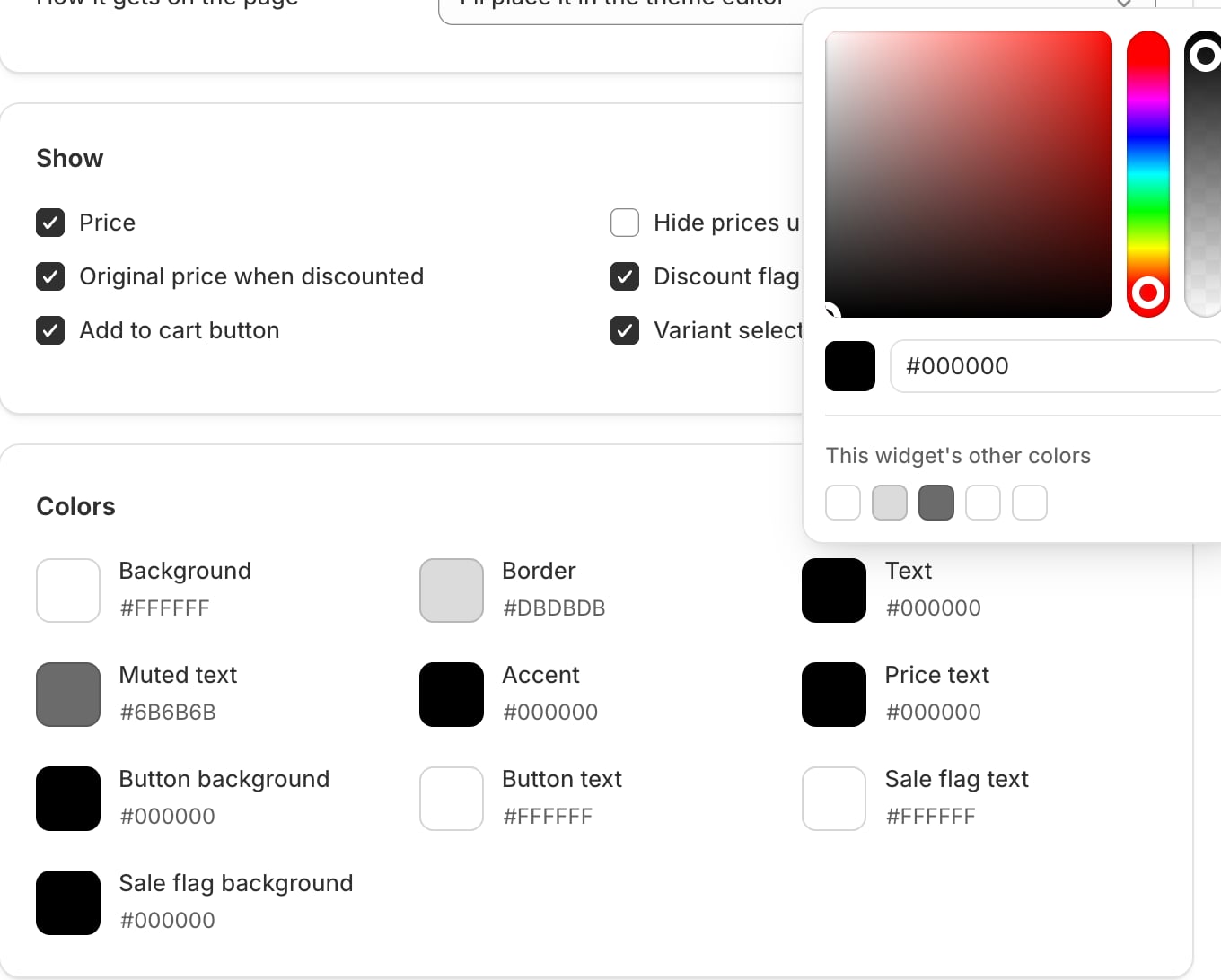
Every colour the widget uses is on screen at once, each named for the job it does. Click a swatch to open a colour picker with a hex field, or type a hex code under it. Each picker also offers the widget’s other colours, so matching the button to the accent is one click.
| Colour | What it paints |
|---|---|
| Background | The card behind each product. |
| Border | The card's outline and the dividing lines. |
| Text | Product names and headings. |
| Muted text | Secondary lines, such as the struck-through price. |
| Accent | Keyboard focus rings and the Buy together checkboxes. |
| Price text | The price. |
| Button background | The add-to-cart button's fill. |
| Button text | The button's label. |
| Sale flag text | The words on the discount flag. |
| Sale flag background | The discount flag's fill. |
Match my theme
A new widget starts on your theme’s own colours, read from its default colour scheme, and keeps following them while you leave the swatches alone. Change any one and the widget uses the colours you set. Match my theme puts them all back to your theme’s.
Text
The Text section of the widget editor holds every word the widget shows: the Heading, an optional Supporting line, the Add to cart button and Sold out label, and for Buy together the Add selected button, Total label, Current product label and Saving line, where {amount} becomes the saving. Write for your store rather than accepting the defaults: “Goes well with” earns more attention than “Related products” on most storefronts.
To show shoppers in other languages different wording for the buttons and labels, add the language under Settings, Translations. See Settings.
Accessibility and motion
The widget ships with real buttons, keyboard navigation, visible focus rings and a default palette that meets 4.5:1 contrast. It respects prefers-reduced-motion, so rows do not glide for shoppers who have asked their system to stop that. If you set your own colours, check the contrast, because that part becomes yours.
Something here wrong or missing? Tell us. We would rather fix the page than answer the same question twice.